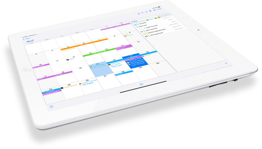
We have been running a fun daily “Tip of the day” feature on our Twitter account for @ultiplanner, and we thought it would be good idea to bring them over here as well for easy access. Make sure you check out both places as more will be added.

Tip of the day: Slide up on the main month calendar to turn it into a week strip view, slide down to make the month full screen.
Tip of the day: Find the “custom filter” button at the end of the tab list of filters (shown with main filter button in bottom toolbar). Now create a powerful filter to easily access another set of data, filtered by tags, calendars, participants and with its own look.
Tip of the day: Try out the embedded list feature to quickly add and update lists in your schedule items. On the card view of an event or reminder hit the “List” button to make shopping, todo, or other checklists that will get saved right in the notes.
Tip of the day: Use an app like @launchcenterpro with the “ultiplanner:” app url to quickly open our app. “ultiplanner://newevent” and “ultiplanner://newreminder” will try to jump to item creation. We’d love requests for what else you’d like added!
Tip of the day: Cut-Copy-Paste functionality is built right in. Sliding left (or holding) will expose menus with “more” that have copy and move choices for that item. Select it and the item will be remembered, and then tap-n-hold on headers or month days to expose “paste”.
Tip of the day: If you hold on the app icon when outside the app, it has shortcuts to add an event or a reminder built in to the menu that pops up.
Tip of the day: On the month and week and timeline views, if you tap and hold on an event or reminder you can drag it to another day to move it. Drag-n-Drop!!!
Tip of the day: Hashtags can be added to any event or reminder from the Card View, and will be stored in the notes of that item. The interface remembers already used tags for quick re-entry. You can then assign icons to hashtags in Settings, and use them in custom filters!
Tip of the day: To delete your completed reminders, in a list or view hit the edit button , and it will appear at bottom of the screen.
Tip of the day: You can use the jump (arrow in box) button to jump to a new date on the view. Holding “Today” will have same effect, especially on month view where room is limited.
Tip of the day: Tap-n-hold is powerful in a lot of places. Month days, Agenda List headers and items, Block Week headers, Timeline Day time slots all will show you helpful popup menus.
Tip of the day: When using the quick entry screen, if you start typing something that matches a saved template, a type ahead list will show allowing you to select it.
Tip of the day: You can click on the weather icon in upper right of days to see more weather information.
Tip of the day: It is easy to convert an event to a reminder and vice versa, you can pull up on a card view to expose more options and the button in lower right will do this. It also is available in some sub menus of each type.
Tip of the day: Keywords are added under ‘Icons’ in Settings with the +. They can be used to assign an Icon to any item who’s title contains that keyword. They can then be further used in custom filters the same as how a #hashtag works.
Tip of the day: You can tap-n-hold on a custom filter in the filter bar to edit it.
Tip of the day: Create an event or reminder template from an existing item(create one temporarily?). Then choose ‘Save as Template’ from the More menu of the item. Main fields will be remembered. And add ** to the title to be prompted to fill in the blank when using it from +.


