In the months leading up to the release of Ulti-Planner, I’ve been studying other apps and the value proposition of subscriptions and upselling in apps in general.
I have always been quite conservative in this area, but realize the market has gotten to a point where you need to get back to charging what’s “fair” and it’s necessary to do some kinds of pressure on the customers to help support the project.
Pricing
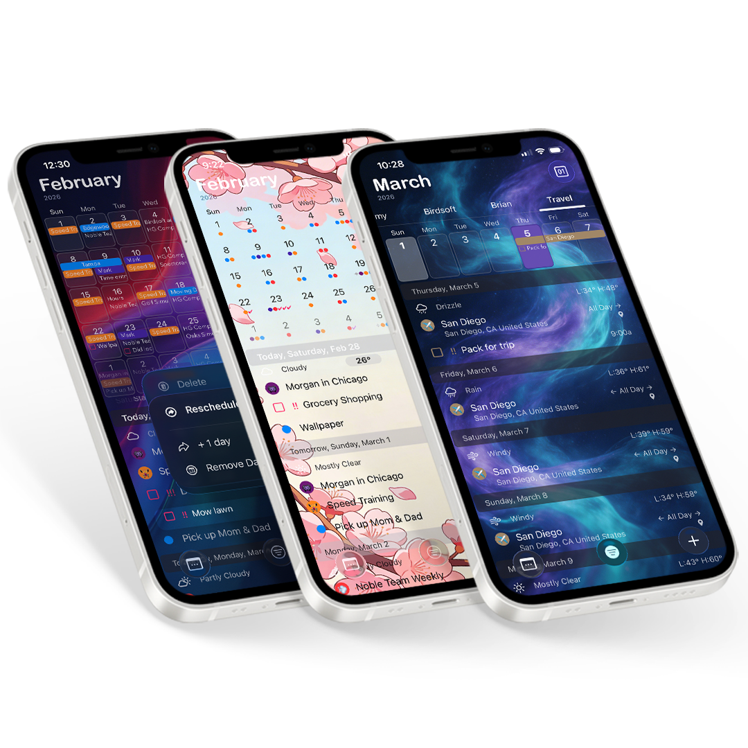
For Ulti-Planner, we really believe we have what is basically the top of the contenders for iOS calendar planner apps. I can make a great argument it is better than Fantastical, Readdle, Informant, WeekCal, and any of several other similar competitors.
So what did we decide to do for pricing?
We still went with giving you what we think is the “fair” price. We are about half what they try to charge for what are essentially very similarly featured apps.
Let’s compare yearly subscription prices:
Ulti-Planner is $12.49/yr US.
Compare our price to Readdle at $19.99/yr, WeekCal at $19.99/yr(unless you want weather too), Informant is $25.99/yr, and finally Fantastical, which is fantastically priced at $57/yr. Now we get that Fantastical and others might get you the Mac version as well(and some charge more), which we plan to offer a Mac app too, but for Fantastical that’s $45/year more for that honor. If you love it it might be worth it. But we are looking at iOS here.
And yes, there are a few features here or there that one app might have that is actually worth it for very specific users, we have some of those too. But then most of those features in other apps require you to have yet another user account, this time with your calendar app provider? And then data security and other questions come into play.
But now start adding in our other big features. We have contacts, which is the basis for other subscription apps. We have weather, which we know feature wise doesn’t quite reach the level of the big subscription weather apps, but it is great now for your quick forecast or a peak at your current weather. It’s pretty good. And we have projects, which similar apps to just our project module can run $29.99/yr or more.
In us setting this price, will some people wonder if the perceived value is greater for the more expensive app, just because they are willing to charge more. Yes, probably. But is it true when you actually take the time to compare. Not even close.
Starting Over
We realize it is probably somewhat a mistake to have started over to try to create what is essentially a new brand. The AppStore algorithm’s may have worked a lot more favorably with our established apps with tens or hundreds of thousands of downloads and sales. But our apps had fallen down the ASO AppStore hole after losing track of just what Apple deemed important for the moment. Being customer focused, we didn’t shove rating requests down your throats for years, and kept prices fairly consistent as to not rock the boat.
But the ratings thing has turned out to have hurt us dramatically in how apps are ranked now. With us playing the “fair” game of not buying reviews, while so many others have bought them buy the thousands with no repercussions from Apple, it seems we were wrong. So our older apps didn’t have the rating counts that competes with the people who weren’t as worried about the customer’s user experience all these years or are willing to break the rules.
I know it’s the norm, we’ve begrudgingly adapted to ask for them more. So please hit that five star when asked…
Upselling in the app
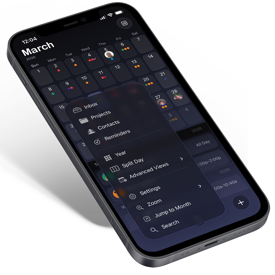
Again we approached this from a customer experience point of view. We tried to make the basic version of Ulti-Planner very usable without much friction, to really give a quality product that people can use all the time regardless of subscription status. We point out premium exists right away in onboarding, and then let you use the basic version without too many interuptions.
We do have the one button in the top toolbar to have a very out of your way, yet front and center reminder that there is more to the app. Other than that there are very few places that you will hit the paywall, with most being in Settings, when you start to explore and become that more advanced user. Most of our features also display a diamond to designate what is in “Premium” to make it is as transparent as possible. And we think we struck a good balance of value in what is and isn’t included.
Now contrast that to the heavy handed experiences you get from some of the more expensive competition.
I couldn’t believe the maze of funneling splash screens that appear on Calendars. There were 4 ads or mailing list requests before you can even see your calendar. And then you are presented with paywalls for features that appear to be there in the main app, until you tap on them to find out differently. Along with that you are presented with ads for their Mac version several times.
Informant also shows you all the features, so they are front in center, but shows you they’re locked, so in the first few minutes of that download you will likely see their carousel upsell screen several times. Essentially there are 5 buttons on the main screen that all only function to show the upsell.
Week Calendar you are presented with their upsell right away, seemingly with the X to close initially hidden. And then you get a Weather Widget ad that basically leads you right to their same upsell. This won’t be the last you will see of ads for the weather additions. And for only $10-20/yr extra over their Pro version. Yeah, weather is at least included in Premium in every other app its offered in. And there are way better full featured weather apps that are much less than that price…
Fantastical is a bit more subtle. With them you find out that they want you to make an account first, and don’t share easily the high pricing until you are in. I assume they also are trying to avoid the Apple Tax with how they work and requiring an account. So why does Apple so heavily favor them?
The Algorithm
So yeah, climbing back up the AppStore is going to be a tough ride, with what appears to be a bigger need to rely on Ads, at least initially. And being the “fair” guy makes it even tougher. But we hope we can get some traction and get to where the AppStore starts feeding us some love. It’s a tough task, but we decided to swim up stream one more time…